Melissa Bakes Website
B2C | Responsive Website
UX Research and Design
Project Overview
In this project, I created a responsive website for Melissa Bakes (no relation), a home baking business.
The Product
The Problem
Melissa Bakes, a home baking business, did not have a website, but promoted entirely via social media and world of mouth.
The Goal
Design a responsive website for the business that coexists with the current ordering process.
Role
UX Researcher
UX Designer
Length
4 Weeks
Toolkit
1:1 Interviews
Personas and Journey Maps
Wireframes
High-Fidelity Prototyping
Usability Studies
Constraints
Client wanted to keep her current ordering process, so website needed to be built around that process.
Website had to be created using a click and drag no-code website builder, which limited design possibilities to the elements within the builder.
My Role
I was the sole person working on this project, and served as both a UX researcher and UX designer. I conducted generative user research, defined user personas and journeys, designed the app, and iterated on the app design by gathering insights from usability studies. I also implemented my design by using a click and drag no-code website builder.
Empathize
Research Goals
Determine which website features would be the most useful to users.
Determine whether users want to pay via credit card.
Approach
Qualitative. 1:1 interviews with 5 past customers to understand their experiences.
The 20-minute interviews were conducted via phone.
Why This Approach?
Because I have little background information, a qualitative approach will allow me to quickly gain insight into user experiences. The ability to ask open-ended questions and follow-up is especially important given I have little background information.
Key Questions in 1:1 Interviews
Tell me about the process of ordering from Melissa Bakes from start to finish.
What was your method of payment? Would you like to pay via credit card?
Imagine you want to order from Melissa Bakes again. What could go better next time?
Key Interview Quotes
Imagine you want to order from Melissa Bakes again. What could go better next time?
"I'd like to see examples of artistic things [Melissa Bakes] has done." - Participant J
"I'd want an inspiration Look Book." - Participant A
Would you like to pay via credit card?
"I wouldn't use the card option." - Participant J
"I can see how [paying with a card] would be useful, but I'm a dinosaur and I like to use cash." - Participant H
Define and Ideate
Affinity Diagram
With detailed notes from the 1:1 interviews in hand (including the quotes previously mentioned), I started working to define the problem. I created an affinity diagram, developed a user persona, and determined key user pain points.
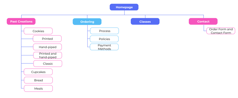
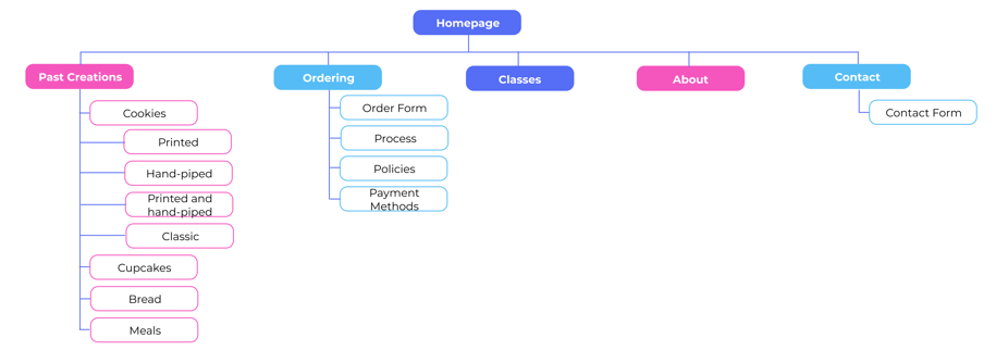
Finally, I conducted the ideate process to determine website features and developed a sitemap.
Though the key client constraint was that she wanted to ensure the website worked with her current process (as opposed to changing it), the interviews confirmed that the process tended to go well overall in no small part because the business owner was easy to work with. Users saw the value of credit card payments, but wouldn't use that feature themselves. One thing that users struggled with was that they like seeing example pictures of baked goods for inspiration for their order.


Jacob is a 25-year-old who recently got married. When planning for his wedding reception, he purchased custom cupcakes from Melissa Bakes. He feels the process went great overall (and the cupcakes were great), but next time he wanted to see more visual representations of Melissa Bakes’ work.

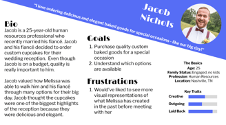
(1). It can be difficult to have an idea of what Melissa Bakes can do before you meet with her.
Main Pain Point
Persona: Jacob
Ideate and Sitemap
Because typical users themselves did not see the need to pay via credit card and liked the current options of cash or check, I opted to not add a credit card payment ability into the website.
To help address the user pain point of wanting to see examples of Melissa Bakes' work to inspire their future orders, I decided to include an inspiration page on the website that had examples of Melissa Bakes' main types of baked goods.
The client wanted a page that included her cookie decorating classes, which she plans on expanding in the near future.
Finally, I opted to design a very broad order form and place it on the contact page where customers could start their order.
The resulting sitemap looked like this:

Prototype
It was then time to prototype the desktop and mobile app versions of the website.
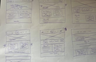
I started off with paper wireframes.
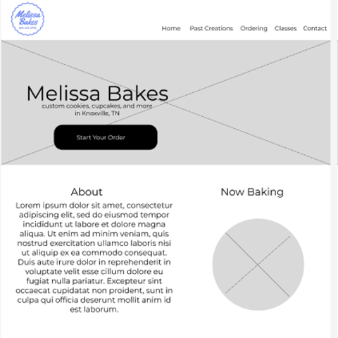
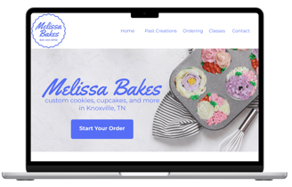
Using Figma, I then created digital wireframes and low-fidelity prototypes for mobile and desktop.
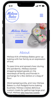
For the mockups and high-fidelity prototypes in Figma, I used Melissa Bakes' current logo as inspiration for the color scheme and font. I relied on Font Awesome for icons.


Test, Re-Design, Test
I opted at this point to build out the desktop and mobile versions of the website using a drag and drop no-code website builder to allow me to test whether users could accomplish tasks with the actual website.
Research Design
Study Type: Unmoderated usability study held remotely.
Participants: 3 adults performed 2 tasks in the website and answered questions about their experience for 15 minutes in exchange for $20 in gift cards.
KPIs: Task success rate and time on task
Study Programming: Loop11
Participant Recruitment: User Interviews
This approach allows participants to perform tasks on their schedule in a slightly more natural environment than if I was moderating the test. The biggest downside is that though I included questions prompting for general feedback, I would be unable to ask participants to elaborate in the moment.
Why This Approach?
Unmoderated Usability Study Findings and Action Items
Requesting an Order Via the Order Form
During their first task, users were asked to request an order of 2 dozen sugar cookies decorated in the style of their favorite sports team. Though 100% of users accomplished this task in an average time of 81 seconds, user behavior indicated a lot of confusion. 100% of users had multi-target hesitation. Essentially, all users kept switching back and forth multiple times between the contact page (where the order form was and where a call-to-action button directed them) and the ordering page before ultimately using the form.
No users verbalized their frustration or confusion, but it was clear from the click paths that users were confused about where to go.
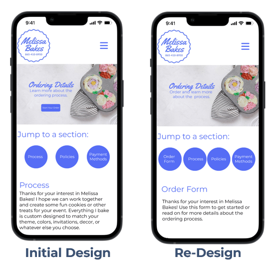
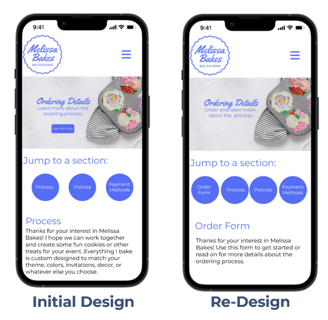
In response, I redesigned the mobile and desktop website so that the order form was the first thing that users saw on the ordering page. I also redirected all call-to-action "Start Your Order" buttons to the ordering page.
Using the Past Creations Page to See Examples of Past Baked Goods
During their next task, participants were asked to find examples of bread baked by Melissa Bakes (it was on the past creations page) and 100% of users successfully found the pictures of past bread, in an average of 78.5 seconds. However, the average time on task was heavily inflated by the mobile user (127 seconds) versus desktop user (30 seconds).
The desktop experience seemed quick and straightforward to users, but the mobile version required too much scrolling to find what users needed:
"I can't figure out where to find bread.... This is a lot to scroll through and review." - Participant A
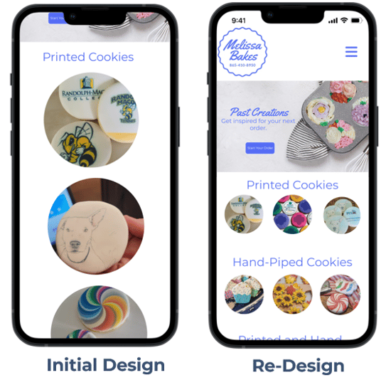
In response, I redesigned the mobile version of the past creations page to have much smaller images that would still allow users to see detail, but require for far less scrolling.
Re-Test and Results
After finishing the newly redesigned desktop and mobile website, I replicated the unmoderated usability study. I added a new KPI of multi-target hesitation for the first task.
The re-design performed better on several KPIs than the initial design. Because of the longer order form, participants took a similar amount of time to request an order, but they had no multi-target hesitation or website wandering as in the first design. Participants, and mobile participants in particular, were able to much more quickly find examples of past bread.
Requesting an Order Via the Order Form
Success rate remained 100% with redesign.
Average time on task was similar (81 seconds with original, and 82 seconds with longer re-designed form).
Users with multi-target hesitation declined from 100% in the original design to 0%. Users no longer wandered around the website with the re-design.
Using the Past Creations Page to See Examples of Past Baked Goods
Success rate remained 100% in redesign.
Average time on task overall declined from 78.5 seconds to 19 seconds.
Average time on task for mobile users declined from 127 seconds to 19.5 seconds.
Another insight from this task was that users wanted more detail in the ordering form itself to prompt them to think through what they wanted in their order.
"Actual ordering form should be more robust...[make it ask for me to] put in key details." - Participant C
In response, I redesigned the order form in both mobile and desktop with quite a bit more detail and questions. This would likely make it take longer for users to fill out the form, but it would provide a more detailed description of what they wanted to order.


General Feedback on the Experience
Before users wrapped up the study, they were asked to verbally tell us about the experience of using the website.
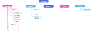
One of the users noted that they did not want to scroll through information about the baker on the homepage. In general, they found the homepage had too much information that distracted them from their goals.
"I do not like the layout of this [homepage]. There's just too much [information]." - Participant A
In response, I moved about information to a separate page on both the mobile and desktop versions, resulting in the a final sitemap:
In general, participants reported that using the re-designed website (both on mobile or desktop) was very easy.
"Overall, the website is very intuitive." - Participant A (mobile)
"The website was easy to navigate." - Participant B (desktop)
Next Steps
With the major frustrations addressed, I officially handed the website over to the client, who is currently creating a list of anything that they would like tweaked in terms of information provided before the official launch.
Important steps I will continue after the website launch include:
Compare sales before and after official website launch
Interview frequent customers about their experiences with the website
What I Learned
Impact and Learnings
Impact
Actionable insights reduced multi-target hesitation from 100% to 0% when trying to find ordering form.
Actionable insights reduced mobile user time in finding past examples of baked treats from 127 seconds to 19.5 seconds.
Some of the key things I have learned include:
When testing designs, consider KPIs beyond task success and time on task such as multi-target hesitation.
If I redid this project, I would specifically recruit more users and equal numbers of mobile and desktop users if the project constraints allowed.